Six directions in four days
Our own website started over six times before it settled on black, white and one blue. What we threw out taught us more than what we kept.
- Project
- Tavor Digital website
- Year
- 2026
- What we did
- Brand, design, development
- Built with
- HTML, CSS, JavaScript, WebGL2, a small Python build
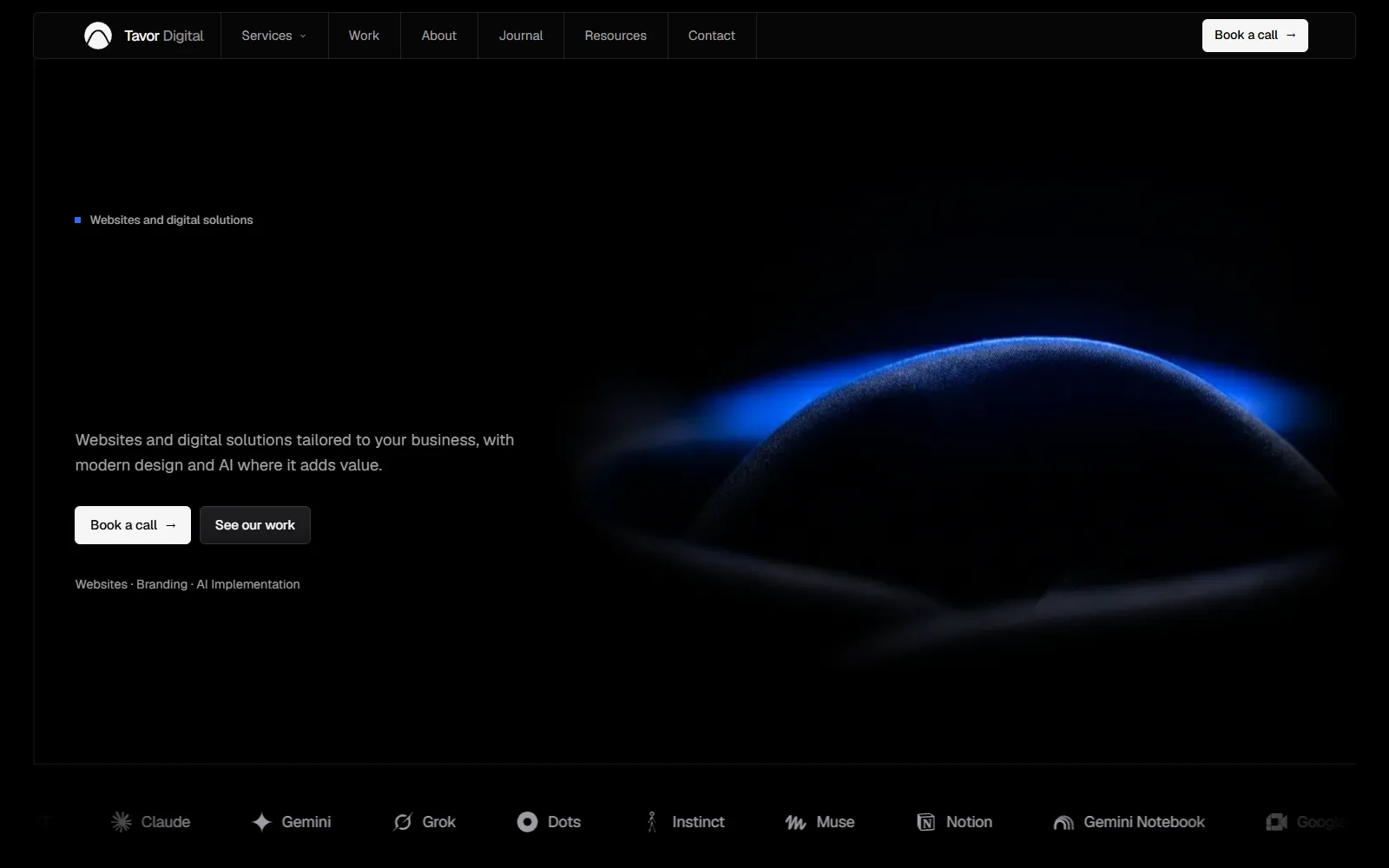
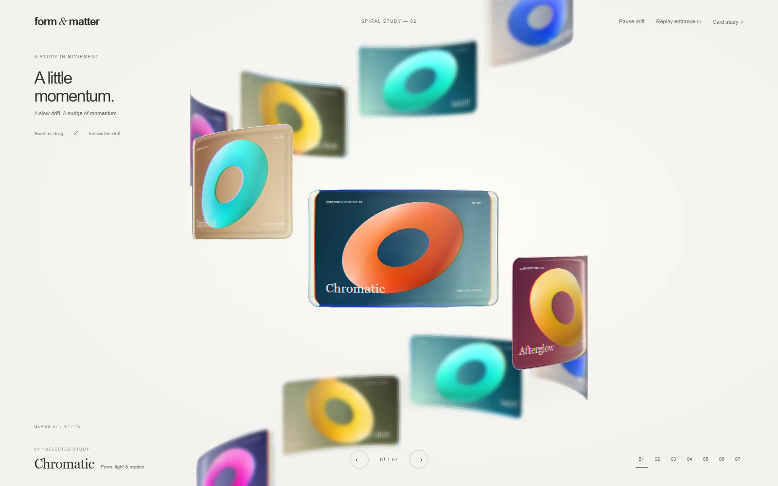
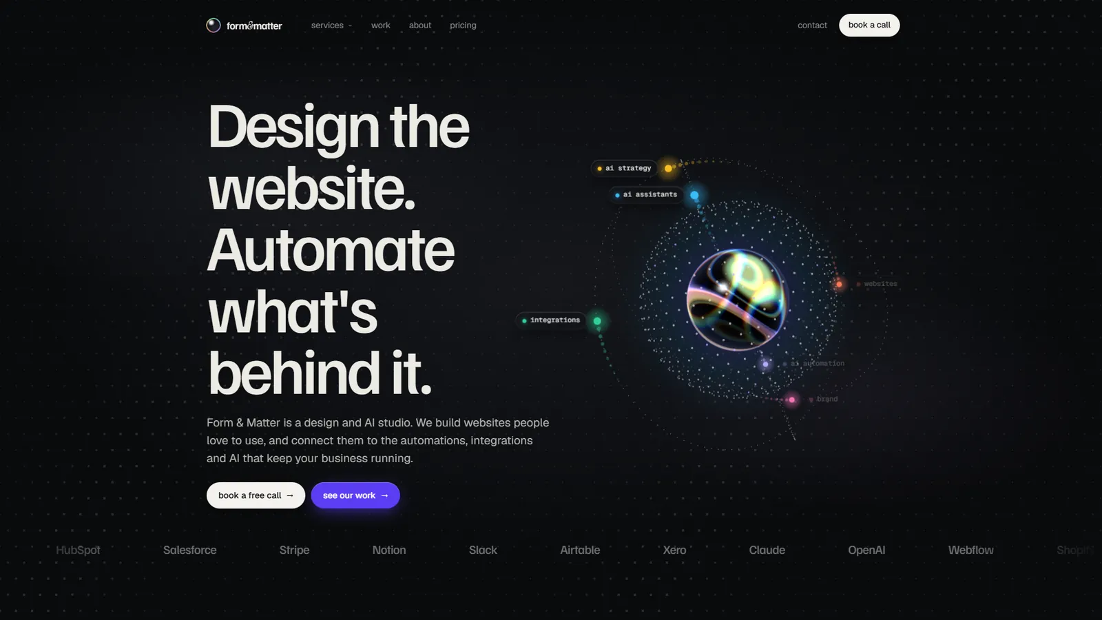
Designing your own studio's website is the hardest brief there is, because nobody stops you from starting again. Ours started again six times in four days. A particle ribbon and a purple planet on the horizon. A bright product-marketing site. An orb with orbiting labels. A ray-marched night render of the mountain. A plain black, white and blue site. Then the silk dome you see now.
What we threw out
Partway through, we made a list of everything that made the site look like a template, and removed all of it in a single change:
- readouts styled like a heads-up display
- a dotted grid in the background
- gradient text
- clusters of pill-shaped labels
- sparkles
- headlines that blur in
- a giant faded wordmark across the footer
None of these is wrong on its own. Together, they're what a thousand generated landing pages look like, and they say nothing about the business behind them. The rule we kept afterwards is written into the brand guide: no spinning globes, no particle storms, no rainbow effects.
The direction that stuck
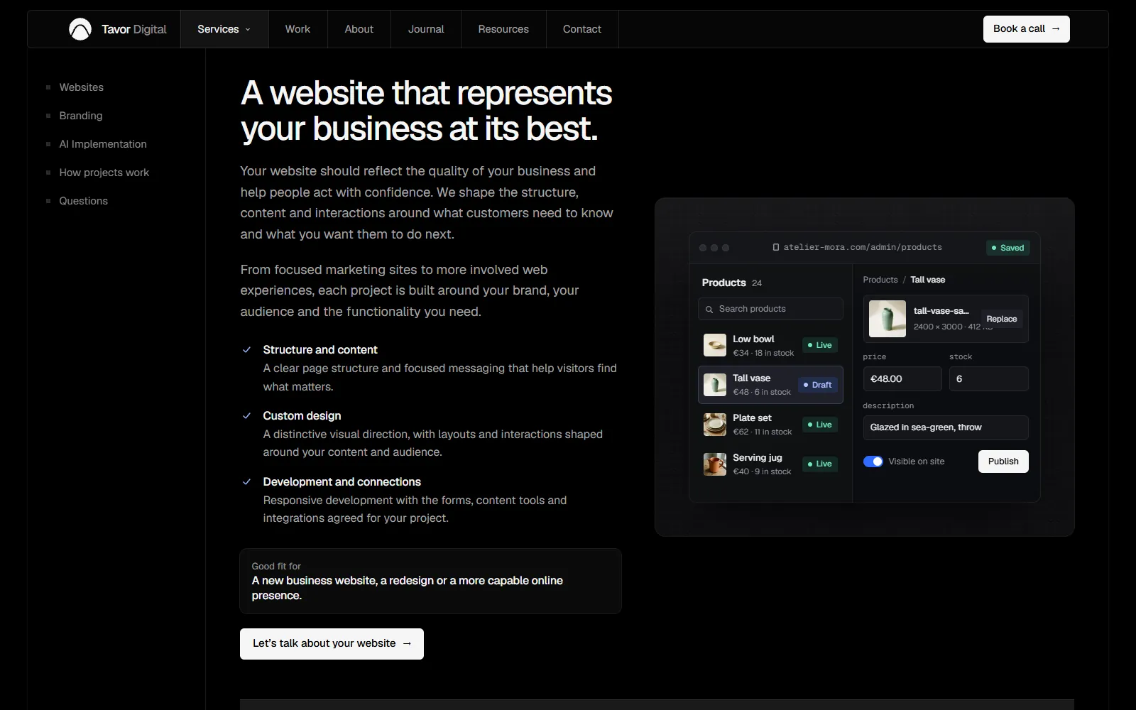
The site is black, white and one blue. The page is a single framed column with two rails running down its sides, and quiet lines divide it into rows and cells, like a blueprint. The colour lives in the pictures and the interface demos, not in the furniture.
The system is small on purpose:
| Part | Rule |
|---|---|
| Colour | Black ground, near-white ink, one blue (#2f6bff), green only for live and success states |
| Contrast | Body text 8.6:1, the quietest text 6.1:1 |
| Type | Geist only, at five heading sizes and no more |
| Motion | One duration for every transition: a quarter of a second |
| Glow | Blue light in exactly two places: the hero and the closing section |
The hero
The hero is a picture of dark silk folded into a single dome, with its ridge lit blue: Mount Tavor, without drawing a mountain. It was made with an image generator, and it's the one place we let one lead. Moving the pointer leaves a liquid trail that bends the picture. To keep it light, the trail is simulated at a fifth of the picture's size.
Making it fast
A site that says it builds fast websites has to be one. A single round of work:
Later we removed smooth wheel scrolling altogether and went back to the browser's own. The rule since then is that nothing may scroll the page except the reader.
Words
The copy has its own rules: no hype words like "revolutionise" or "supercharge", no invented numbers and no testimonials we can't show. It's the same restraint as the design: if a sentence would fit any studio's website, it doesn't belong on ours.